

Up Side
Skills
Overview
Branding
Packaging
Illustration
Year
Spring 2023
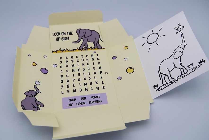
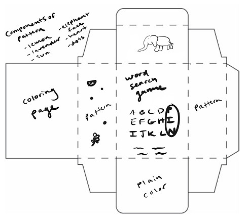
Up Side is a line of bar soap that is based on human emotions. It is targeted towards kids and their parents with the goal of helping children deal with difficult emotions. This specific design is based on the emotion of sadness. The exterior of the box conveys the reality of sadness, while the interior is bright and uplifting. The activities on the inside of the box, the tips on the outside of the box, and the calming scent are intended to help kids look on the "up side" when their feeling down.


Process
Mood Board
I began this project by gathering sad imagery as well as some soothing imagery. I wanted to capture the feeling of sadness in a way that was not too intense or explicit.


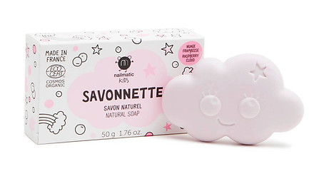
Packaging Inspiration
I then gathered various images of children's packaging to get a sense of the illustration style, typography, and colors that others have used to appeal to a young audience.


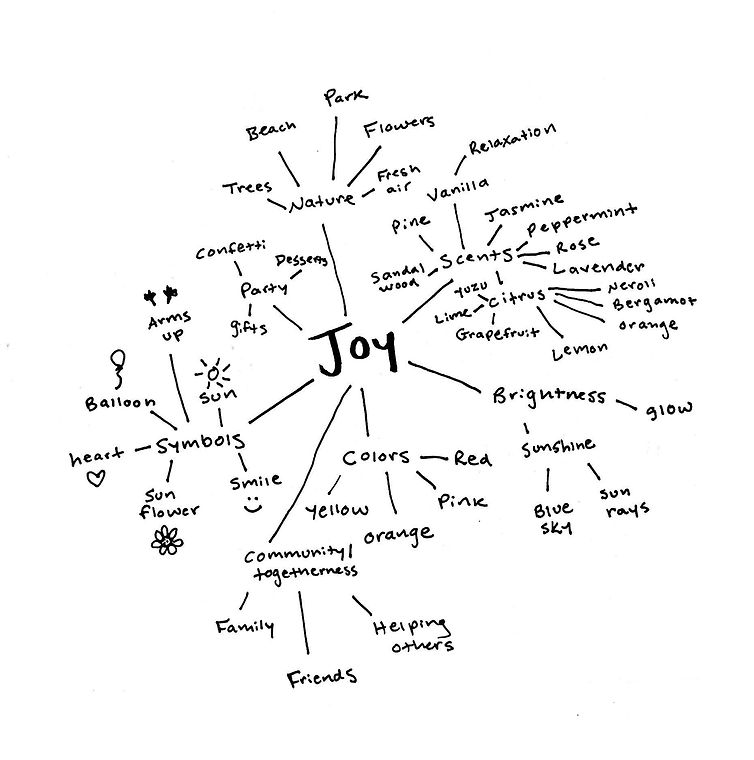
Mind Mapping
I brainstormed a wide range of colors, scents, symbols, and topics related to sadness and joy. I wanted to focus my mind on these two opposing emotions in order to successfully show the shift from sadness on the outside of the box to joy on the inside.

Sketches
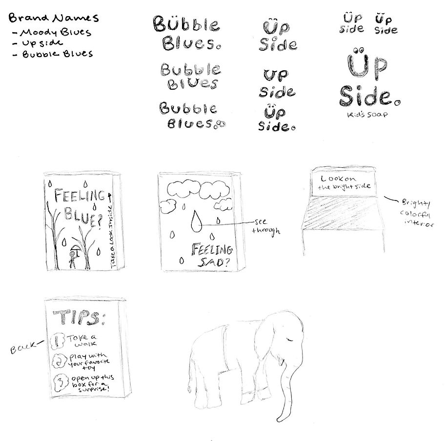

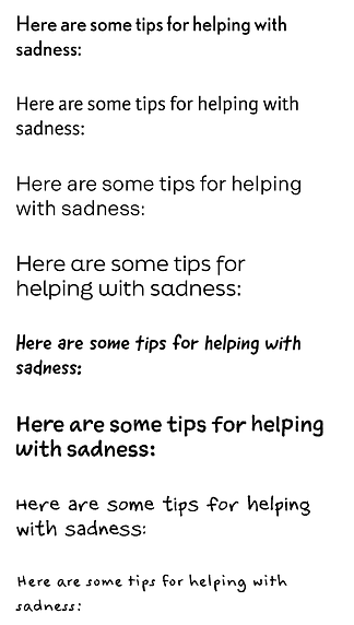
Typeface Exploration
I explored typefaces that were rough, textured, and water-like to convey sadness. I also explored hand-written, juvenile typography to communicate a childlike quality.
Titles/Headings

Body
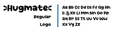
Logo

Visual Identity
Colors

#231F20
#474A73
#2A6591
#8CB5DF
#DFEAF5
#A49CAB
#DAD6DE
#F7F5C0
#F4E463
#AD9CC8
#CBC0DB
#E7E3ED
Up Side Logo

Typography


Illustrations

Iconography


